
PHOTO COURTESY: ROCCO LUCIO FROM FLICKR.
Source: hearthandhome.com, March 2019
Diverse color palettes with never-ending patterns and combinations will be the name of the game more than ever before, said Leatrice Eiseman – executive director of the Pantone Color Institute and color expert for the International Housewares Association (IHA) – at the 2019 International Home + Housewares Show. Her remarks were part of her annual keynote address, this year titled “Color in the New Era: Trends, Twists and Tweaks.”
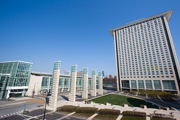
Owned and operated by IHA, the Show was held March 2-5 at McCormick Place and features more than 2,200 exhibitors and 60,000 total attendees from 130 countries.
 |
|
| McCormick Place in Chicago, Illinois. PHOTO COURTESY: GETTY IMAGES. |
|
“There are all kinds of ways to bring the expected into the unexpected – a compelling dichotomy, you might say – where we’re seeing the real combined with the surreal, and the novel combined with the nostalgic,” said Eiseman. “Some of this might be a bit of a push for some people, but we need to catch customers’ eyes.”
Eiseman explained that she looks at a wide variety of industries for color inspiration, including television, movies, food and beverage, fashion, floral, art, technology, and cars.
For instance, she cited the beautiful color in the film “Mary, Queen of Scots” and showed images of how these Elizabethan stylings are cropping up with edgy updates in everything from fashion runways to art and home décor.
There’s also the hugely popular traveling art exhibit, “Andy Warhol’s Shadows,” which offers up an updated, more sophisticated style of Warhol’s previous works. “It’s all about bold color, and black and shadowing,” said Eiseman, adding that the exhibit was one of the inspirations for a 2020 Pantone home palette.
“At the same time,” said Eiseman, “there is that other need humans have, particularly in the world we live in today, for comfort and calm.”
This is where softer palettes come into play, though there is still a need to update these with unusual twists to attract attention. The popularity of health and wellness treatments, hydration, and herbal tea all factor into these color groupings.
Among other trends:
- Black and white striping used with another pattern is one of the newest and hottest.
- “I’ve never seen so much sparkle in the marketplace,” said Eiseman, who showed an image of gold even being incorporated into woven baskets. Based on the continued strength of metallics, Pantone just produced a new color deck solely with shimmery hues.
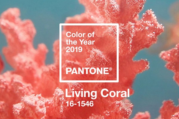
- There’s also Living Coral, Pantone’s 2019 Color of the Year, which “conveys instant warmth and is really embraceable – it’s almost like it’s reaching out and touching you,” said Eiseman.
 |
|
| Living Coral, the 2019 Color of the Year, from Pantone. PHOTO COURTESY: PANTONE. |
|
In terms of on-trend materials: Marble can be seen from everything from the interior of Infiniti’s QX concept car to wedge heels on women’s shoes. Terrazzo, in particular, is popular as a design influence, but also as a societal influence because it involves the idea of reusing marble.
Metallic materials are especially popular when combined with an unlikely partner: wood. “There’s a real marriage of the warmth of rich patina wood and (the cool, sleekness of) metallics,” Eiseman said.
She added there’s more texture than ever before, which often is needed to contrast with the sleekness of metallics. Felted products are becoming popular, as are birds and feathers.
Last but not least, Eiseman shared images featuring the eight brand-new 2020 Pantone View Home + Interiors palettes. These color groupings are also on display during the Show in the Pantone ColorWatch display in the Hall of Global Innovation.
They are:
- Metropolis – This palette conjures up images of steel-girded skyscrapers, light reflecting off windows, and the gritty asphalt below. It’s a mix of glamour and industrial chic, combining striated old-world marble, deepened wood patinas, and futuristic metallics. Accents of plum wine and elegantly deep lavender add a sophisticated touch.
- Trekking – Trekking is “a grounded palette” that shows an appreciation of the outdoors. This is a palette very much influenced by fashion favorites of plaid flannel and well-worn denim. “Red plays very heavily in this palette,” said Eiseman, and a spicy mustard adds warmth.
- Skill Set –This palette demonstrates “an appreciation of things that are hand-made,” said Eiseman. It evokes the hues of hand-thrown pottery, hand-tooled leather, forged steel treatments, and wine-dyed spoons rescued from old oak barrels.
- Prints Charming – One of Eiseman’s favorites, this palette is inspired by an image of a modern-day Prince Charming dressed with some traditional Royal stylings but with some modern twists, including patterned tattoos. Bright blue, red, and yellow are calmed by an umber brown and a minted green; black and white provide contrast to it all.
- Beyond the Pale – This palette is “about taking pastels and kicking them up a notch,” said Eiseman. It shows that different permutations of pinks can co-exist, and includes a smoky green, a blue-green, a mid-tone Infinity blue, a lively greenish-yellow, and a contrasting tawny brown.
- Tempered Tastes – Tempered Tastes is “one of those palettes you know there is a certain level of acceptance for, but you’ve got to do something a little different with,” said Eiseman. It’s goes beyond just neutrals to incorporate some shimmery metallics including Pantone’s Gold Leaf and the rose-toned Agave Nectar.
- Show Stoppers – The energy is palpable in this palette packed with vibrant hues such as Twinkling Diode Blue, Leprechaun Dust, Spectra Yellow, and Purple Orchid. It’s a combination that kids (or kids at heart) would be drawn to; in fact, Eiseman compared it to a colorful mix of jelly beans.
- Tea Garden – Evoking the calm and natural beauty of a Japanese tea ceremony, this thoughtful palette features blue in the shades of sky and sea, serene greens, lavender, yellow-green, a “pungent chai shade,” and a touch of mango.